Cash flow, creativity, and compassion are not mutually exclusive™

Why I’m starting to hate Apple

I’ve long admired Apple for its branding prowess, it’s ability to connect with customers, to innovate, to “think different.” But the recent fight they are having with Adobe over Flash on the iPhone and iPod has got me seeing their brand in a whole new light – and not a very flattering one.

Today’s WSJ had an article about Apple winning new ground in their very public war with Adobe about the decision Apple made to not accept Adobe’s Flash programming – the programming many websites already use for video and animation – on its devices.  Apple has shut out Adobe from its own devices to promote its own tools and its “under development” HTML 5. Steve Jobs has lashed out with technical reasons why Flash isn’t good for its own devices, and Adobe retaliated with full page ads trying to get Apple on its side and garner public support.

I admit to not even knowing these technical reasons. I’m more interested in the perception and brand impact. I’ve never seen such brand hypocrisy in blatant black and white in the same article. Out of one side of their mouth, Apple claims it believes in open standards “like HTML 5” (hmmm….interesting, their own product)  and says Flash is proprietary to Adobe. It may well be, but from a customer point of view (and developers are their customers too) Flash is what most folks out there are already using and what most websites and apps already use. Now, Apple is forcing customers back to the drawing board, or worse, forcing them to maintain separate apps and websites for different devices.  The whole point of “open standards” is that apps can be used on any device and if many companies have already invested in using Flash to date, why not just also allow Flash on the Apple devices as people move over to using HTML 5, if it truly is an open standard?

Out of the other side, the article states that Apple wants to protect its competitive advantage (which I totally get and respect) by preventing developers from creating apps for the iPhone or iPad that could be used on other devices. If memory serves, when Microsoft got slammed for bundling their Internet Explorer browser with their operating system, wasn’t this action labeled “monopoly activity” and an anti-competitive practice? One customer in the WSJ article, Venveo, a web-design firm, says it has to build apps and websites for Apple devices separately because it has little choice due to iPhone’s popularity. Sounds like a monopolistic chokehold to me.

When did Apple turn into “the man”? I guess it was inevitable. Smart, friendly and fighting the “big dogs” can only work as a brand as long as you’re the small dog. Then when you get to the other side, you start to act just like the companies you used to condemn because you can see the upside. And other companies are taking their cue: I read yesterday that the new UrbanSpoon dining reservation system that is rolling out into full launch can only work for restaurants on an IPad, not on the restaurant’s existing reservations system.

Again, I don’t claim to understand the technical reasons for these decisions- but I wasn’t born yesterday: I doubt it has nothing to do with market dominance and freezing out the competition just because you can. My main issue is that Apple is doing something that forces customers to react a certain way, gives them more work, more expense and less options – and tarnishes their well-established brand promise in the process.
Cash flow, creativity, and compassion are not mutually exclusive™

Want juicy brand advice? Check out this pretty book


FinalBookCover

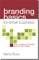
I think I need to write a book about the process of writing a book. What a ride! Branding Basics for Small Business can be preordered if you email preorder@norlightspress.com with your desired qty. All the juicy advice on building an irresistible brand you can stand – plus case studies & anecdotes galore. Here’s the delicious book cover – thank you to Bridget at TRAYcreative (@TRAYcreative for Twitter folk)

Cash flow, creativity, and compassion are not mutually exclusive™

C’mon baby, light my (entrepreneurial) fire

How’s your cashflow and your mojo? Does your vision match your reality? Does your brand match your soul?

Danielle LaPorte can help you answer these tough but important questions so you can make your business dream a reality. I’ve loved her brazen and authentic style ever since we first met a few years ago on a client project. I’m thrilled to talk to her in today’s Ask the Expert about her new digital experience for entrepreneurs: The Fire Starter Sessions. As she says in her witty and wonderful way: “It’s an e-book meets video transmission of acumen and love.” Whether you’re in the early idea phase or a well-established rut, Danielle wants to light a fire under your….aspirations.

THE FIRE STARTER SESSIONS is: Worksheets that help you draw conclusions, quick videos with motivational punch, connections to current thinkers, practical smarts, and frank wisdom — THE FIRE STARTER SESSIONS is packed with inspiration that you will put to use. Danielle has worked with 462+ entrepreneurs in her 1-on-1 Fire Starter consults. For CEOs, coaches, artists, retailers, bestselling authors — from site design to big dreams — Danielle’s strategies combine passion with pragmatism to get to fulfillment and cash. And she’s also got nuggets from A-list marketing strategists, pro-bloggers, experts and creativity coaches.

RS: Hi Danielle. Tell us a bit about you and what White Hot Truth can do for business owners?

DL: I’m part strategist, part philosopher. Someone once said I’m a cross between Deepak Chopra and Janis Joplin. Kinda fits. I write about self realization, and I jam with entrepreneurs in my 1-on-1 "Fire Starter Sessions". And after working with hundreds of entrepreneurs to help them rock their careers, I decided to launch "The Fire Starter Sessions" as an online program.

RS: What is this deliciously explosive online experience all about and who is it meant for?

DL: If you’ve got the entrepreneurial spirit – this is for you. You: are likely sitting on an empire of content, product, services, and prosperity that needs a spark — or blow torch — to take you to the next level. You: want to rock your revenue streams and do meaningful things in the world.

RS:What one big mistake do you see entrepreneurs making over and over again that stymies their success?

DL: They take for granted how much they really have to offer. So many people are experts, tribe leaders, teachers – swimming in their own knowledge. A lot of what I do is about showing them the value and potential of their natural strengths and experience.

RS: The White Hot Truth brand is especially authentic and attractive. What intentional decisions did you make about your brand early on and can you give us an example or two of how you live it out in practice?

DL: "Especially authentic and attractive?" Why, thank you (insert batting eyelashes.) When I went solo to start White Hot Truth I vowed that I would never dummy down, I would never shrink from my spiritual or intellectual power, I would only put out material that I felt was useful. So far, so good.
Even though I’d been "blogging" for a long time, when I launched White Hot Truth it took me about three months to find my truest voice. I thought I might write about style…but, nope. Relationships… nada. I let myself feel what I really WANTED to talk about, not what I thought would sell. And that’s made all the difference to not only deepening my creativity and quality of work, but the quality of people who are shown up for it.
Passion has a way of doing that.

Details:

DIGITAL FIRE STARTER SESSIONS…a digital experience for people with the entrepreneurial spirit.

Pre-ordering opens April 7 with a special sneak peek chapter. Worldwide release is May 12. The program is $150, with $5 from every purchase going to The Acumen Fund or WomenforWomen.

WATCH THE VIDEO: Danielle sparking up The Fire.

Cash flow, creativity, and compassion are not mutually exclusive™

Telling a story with a label

Love this post by Seth Godin about how simple things like labels and packaging can help further your brand story and customer promise. This is what I mean by finding a unique way to tell your story in every customer touchpoint you have. Some people may just slap a functional label on their product or put it in a boring box. But get creative and find a way to carry your brand promise through to the way the item looks when people see it on the shelves or get it in the mail.

While some packaging ideas do indeed cost way more than others, cash-strapped businesses can still get creative and find a way to present their products in a delightful way that actually furthers their message to customers. Use color, intriguing words, or other ideas to stand out. It’s not about money, it’s about creativity. But it’s also about clearly knowing what your story is so that you can convey it effectively.

Cash flow, creativity, and compassion are not mutually exclusive™

Why I (heart) joy…and BMW

BMW

Photo credit: orangewheels.co.uk

What a treat to unfold my WSJ the other morning and have an 11×11 object fall out.  It looked like a color brochure, printed on heavy stock, and folded into squares.  The top square said the following:

We do not make cars.

We are the creators of emotion.

We are the keepers of thrill.

We are the guardians of one three-letter word.

JOY.

Intrigued, I unfolded it to reveal a gorgeous  4 foot by 3 foot poster ad for BMW.  One one side, each square held a wonderful vignette of people interacting with their car, with captions like “Joy is maternal” and “Joy is youthful”. Others read “Joy is who we answer to”, “Joy can be counted” and “Joy is timeless.” They interspersed what can only be described as “car porn” in some of the pictures, showing BMW’s latest models that are nothing short of breathtaking and modern.

This piece exemplifies all the best things about good brand marketing:

1) It’s believable: I really do believe BMW’s claims that their loyalists find joy in driving their cars, and that they find joy in making beautiful machines.

2) It’s credible: Hey, it’s BMW. They are no slackers.

3) It’s benefit-driven: They focused on a mission and an emotional purpose of eliciting joy in their customers. They focused on the thrill of driving a great car, not just the features and gadgets.

4) It’s differentiating: Others might be out touting fuel efficiency and safety these days, all noble, important benefits for many audiences. But instead of singing the same song, this piece caught my attention because it only tried to do one thing and did it well: it tapped into my emotional thrill for a gorgeous car

4) It’s gorgeous: Truly, the piece was visually stunning and also in line with BMW’s brand and what I would expect.

5) It’s unexpected: It didn’t show up in my overwhelmed in-box or as just a normal full page ad in the WSJ. It literally fell into my lap.  Could get annoying after a while if to many people start doing this, but for now it just made me pay attention.

6) It had a call to action: There was a 1-800 number on one of the squares to call for your nearest dealer. Not all brand advertising has to be as esoteric and abstract as perfume ads, ya know. After all, they want to sell cars.

Well done, BMW, well done. You caught my attention. And ironically, just when my husband and I were debating whether we would buy a Mercedes or BMW if we had a choice. Were you eavesdropping?!

Cash flow, creativity, and compassion are not mutually exclusive™

The Brand of Valentines Day

vday

Many things in our lives have brands, other than businesses: Think Paris, Super Bowl or Valentine’s Day. Yes, I’m late to the party as it was yesterday, but the traditional brand of this festivus of love permeates our culture – and many have even backlashed against it. So how can a holiday have a “brand” you ask???

If brand (as Red Slice always believes) is the image or mindshare that something occupies in a person’s mind, then of course Valentines Day ranks right up there. Just hear the words and what is your reaction? Hearts, red, love, diamonds, flowers, chocolate? And true to form that brand lives in the mind of the consumer (no matter what Hallmark may try to tell us), people who have different experiences with the big V have different brands perceptions. Some people find it tacky, campy or fake. Others take issue with one day out of 365 being approved for “showing your love.” Still others that may not be romantically involved with anyone find it torturous, cruel and lonely.

Valentine’s Day in our house is good, simple, sweet fun but has also come to symbolize “crowded high-end restaurants with horrible service.” We spent a few years trying to dine out on the actual day, February 14, only to finally learn that prix fixe menus and restaurants that try to jam as many people in as possible make you feel like a heifer at the State Fair. We are willing to spend good bucks to dine out in style, but the food is always sub-par. There is absolutely nothing romantic about that – and to boot, many reputedly good restaurants have tarnished their own brand with us because of their chaotic atmosphere and mediocre mass-produced set menus -  to the point that we won’t go back on a regular night. We know this isn’t fair, but hey, once a brand impression forms (and it’s a negative one) it truly is hard to shake it.  These eateries may make a killing on one night of the year – but at what long-term brand price?

What are your brand perceptions of Valentine’s Day? Do you think the “brand promise” of romance, hearts and flowers is an accurate experience, or does Cupid suffer from a brand identity crisis by not walking the talk?

PS: We had our Valentines Dinner on Friday, February 12 this year. And mmmmmm….it was good and well worth the money this time around.  Lark Seattle, which we tried for the first time that night, lived up to its brand and so we will be back.

Cash flow, creativity, and compassion are not mutually exclusive™

Does your space match your brand?

We’ve all experienced that horrible disconnect that happens when a shop or restaurant looks completely different on the inside than the image we got from their ads or messaging. Or what about when a business that you’ve built up in your mind as “sophisticated, classy and cutting-edge” is actually in a sad office park with what looks like Goodwill furniture and bad paneling on the walls?

Your office, store or place of business should reflect your brand promise and the traits you “sell” in your marketing. If you portray your business as playful, innovative and bold, then your offices where you greet clients better portray that. Whether it be through the furniture style, paint colors, artwork or even location, you need to map your brand to the experience customers will have interacting with your space. Many good ad and branding agencies actually have architectural and space planning services to carry the brand through to your location.

This is where folks that think brand is just a logo fall down. If brand is the entire package of reputation, experience and imagery I have in my head, then my experience and perception of the physical space matters. The devil is in the details, as they say.

Bare Escentuals, the mineral makeup company based in San Francisco, was just purchased by Japan’s Shiseido, a high-end makeup line sold in department stores. The brands actually have common core values focused on natural beauty – but with slight variations. I read that if you visit Shiseido’s offices in Japan, you are “greeted by  3 receptionists in matching pink suits who stand up and bow ceremoniously whenever a guest appears. A small Zen garden with spherical plants sits on the executive floor.” They have a very strong image they want to convey that is consistent with the natural beauty and polished sophistication of their brand. Bare Escentuals’ offices in San Franc are more or an organic “mess” according the founder, in line with their natural, carefree beauty brand – people running around in jeans, that sort of thing.

Botom line, if your space welcomes the public (I”m not talking about home offices here, although you can make an argument that you might want to inject some brand elements into that if you can) is should remain consistent with your brand promise and image. Every customer touchpoint matters, especially interacting with your physical surroundings.

Cash flow, creativity, and compassion are not mutually exclusive™

Ask the Expert: What’s your brand promise and what is it wearing?

Forget the hype of marketing alternatives swirling about you. It’s all about the fundamentals, regardless of which channel you use to broadcast your message. There is indeed a reason that Snuggies sell so well, as you will learn below.

One of my favorite people in the world, and the man who teaches me so much about branding and advertising, is Scott Montgomery. Scott is Principal and Executive Creative Director of Bradley and Montgomery,  which has made both traditional and very untraditional advertising, branding and communications for clients like JPMorgan Chase, VH1, MTV, Knoll, Microsoft and many others.Their recent work includes: a national TV and online campaign for Microsoft Windows, “The Mojave Experiment”; retail environmental rebranding work for JPMorgan Chase when they purchased Washington Mutual; launching a documentary and online campaign supporting Chase Bank and Project Homeowner, a massive effort to help homeowners avoid foreclosure through mortgage modifications at community events and crisis centers; the invention of EmotiClips – shared video snippets in support of MTV’s “The Hills” and other properties; and websites and virals for Microsoft Internet Explorer 8. 

He is also a founding partner of Fizziolo.gy, a firm that tracks social media chatter for entertainment companies so they can tell if their movie or TV show will be a hit or a flop.

Scott’s work had been featured in many national creative pubs, won lots of awards and even rapped with Neal Conan on NPR’s Talk of the Nation.

But blah blah blah. This guy is simply a student of humanity who, like me, loves watching how culture and messaging can change perceptions and mobilize people. Scott is that rare  innovative creative mind who, at the end of the day, fully understands that advertising must result in making cash registers ring. He balances artistic integrity with business necessity. And I dig that about him.

With that, I’m giving him 2 editions for Ask the Expert, because he has so much juicy stuff to share. So pay attention.

RS: What do you think makes a strong brand? The fundamentals?

SM: In a world where absolutely everything in media is changing, let me try to define “brand” in a way that won’t: A brand is exactly two things: It’s the promise your offering makes to people, and the clothes that promise is dressed in. The degree to which that combination generates the behavior you want from people is all that matters.

You don’t need to read yet another treatise on how gorgeously effective brands for Apple and Mercedes are. They are perfect promises for people who want beautiful things. They are the mirrors their buyers want to be reflected in. Articles like this one hold up brands like those as monuments to the power of branding, and they are. But you might also be led to think that elegance and branding are the same thing. I submit to you that they ain’t.

I was trained as a graphic designer, so sometimes it pains me to say this – many brands succeed because of the absolute appropriateness of their ugliness. That’s visual ugliness, ugliness in actions, or both. Here’s why I think the definition above holds:

Some really nasty-lookin’ brands have the power of a simple, appropriate promise. “Brands” that are products, like SlapChop, Snuggie and Sarah Palin are nightmares of “good design” but their antithetical relationships to “good taste” give them power in the marketplace. That’s because – as good brands – their promises are simple, their messages are consistent and their visual expressions are in sync with their value. Just like Apple, Mercedes and the others that usually top brand surveys. Same rules, different demographics.

The quality or “rightness” of the thing makes little difference, either. That’s worth noting.
We in the U.S. still consume a small ocean of bottled water that’s been judged to be no better than Manhattan’s tap water, one that’s shipped half way around the world by boat, plane, train and, ultimately automobile, not because of its uniqueness, but because of its Fijiness. It’s nuts, and particularly evil considering some residents of Fiji don’t have access to potable water themselves, and are living under a regime odious enough to get it kicked out of the Commonwealth of Nations back in September for suspending free elections.

But Fiji is a strong, simple brand promise dressed in attractive clothes. Well done. Branding can be powerful stuff in the right hands. Or the other ones.

So, you’d figure if an icky product can benefit mightily, then it should be even easier for the not-so-icky ones. Then why do a huge number of non-icky companies still get it wrong?

I think it’s because they try to promise wildly disparate things under a single name. They design their offerings for too many audiences, or none at all. They promise a promise that no one wants. Or they do nothing to generate customer behavior. Their promises aren’t compelling, they don’t get people talking – either around the office, at the game, on in their status updates. Say what you will about Snuggie as a product, but its footprint in free social media is huge.

This is where I’m supposed to say, as an agency principal, “an ad agency can sort this out for you.” But increasingly, a lot of them can’t. Wedded to a arguably ineffective interruptive model of creative promotion, a great many agency people are, frankly, clueless. It’s a world in which you may have encountered 4 kinds of screens that weren’t a TV today. And how on Earth will they make money if you aren’t watching TV?

The people who are getting it are finding ways to harness the interactions between consumers, and the myriad opportunities for meaningful engagements with products and their promises. Happily, brands are bigger than advertising, and good promises spread in ways we wouldn’t have imagined even 5 years ago – through social media, through entertainment, through fashion, through the recycling of imagery across the web, through celebrities and events, via phone screens and whatever Magical Tablet Media Procurer cum Location Based Social Appliance that Apple and Microsoft are racing to produce at this writing.

That’s why I believe that as much as things are changing, the fundamentals have become even more important. The clarity of the promise, and the appropriateness of its expression are what matters. Clarity of the promise is more important than ever. It’s a little like the old “telephone” whispering game: as opinion about a brand is passed along and repeated across a widening range of outlets and technologies, it has to be sturdy enough to survive the trip.


See Part 2 with Scott about social media innovations here.