Cash flow, creativity, and compassion are not mutually exclusive™

Why I chose Droid over the iPhone: A college student’s perspective

Guest post by Red Slice intern, Suzi An

I traveled to Los Angeles for ten days in early July for a class that I took during the spring and I somehow ended up having my phone stolen five days into the trip. Once I returned back to Seattle, I immediately went to purchase a new phone. I was met with a dilemma: be connected constantly with a smart phone or have a simple phone that performs the necessary functions. As a college student, I feel as if I am missing out on having a smart phone because everyone around campus would be walking around with their fancy phones that could do a million things while my phone struggled to keep up with me. Maybe it was fate that my phone magically disappeared because I was immediately drawn in to the world of a thousand possibilities in the palm of my hand.

When I walked into the retail store, I noticed that T-Mobile had a wall dedicated to shiny and sleek Android phones. Being attracted to sparkly and shiny things, I ended up walking towards the long white wall and staring at a cell phone that essentially looked like the iphone but in Samsung form. I was mesmerized. All thoughts of buying a non-smart phone had completely vanished into the consumer’s abyss. I knew that because T-Mobile does not carry iphones, this was the closest I would ever come to own such a device. My mind flashed back to the TV ad campaigns that Android had put out within the year. All I could think of was what the Droid actually does. The high-tech machine robot in all the commercials had gotten me intrigued by all the possibilities that this phone could do. I carefully pick up the sleek phone and the bright screen turns on. I tap the screen and see that the fallen-leaves-on-water wallpaper moves as if my finger had dropped into the water. It was a little much for me but it was fascinating to see this phone interact with me. I then see all these different applications that were on the screen. I slide through at least 8 screens where each was had at least two apps on it. Long story short, I made my decision in less than a second. I wanted a smart phone just like everyone else so that I could check the weather or stalk people on Twitter or play awkward games like The Moron Test (which I passed, I’m not sure if that means I’m a moron…).

Obviously, I purchased this ridiculously expensive phone and my friends and I compared it to the iphone and their ad campaigns. Now, when most people think about the iphone, they think of AT&T, poor reception, and dropped calls. There is no image that I associate with the iphone, other than the sleek Apple whereas with the Android, I associate it with a hi-tech robot that is able to do everything I want it to do. That’s not a very positive way for the iphone to be perceived but no one seems to care because it’s an Apple product. It is highly desired, easy to use, and profitable. Apple products are undoubtedly popular among college students and because the iphone came before Android, Apple is going to win over customers because people are familiar with the brand. Apple practically infests my campus (to which I undeniably contribute). Although I am a huge Apple fan, I cannot seem to shake the Droid away. It most definitely Does. I’ve spent more time fiddling with my Droid than I have with any iphone. The Droid commercial lives up to its name and I get excited every time I see the small green robot pop out of the corner of my screen. It is as if he’s saying, Hello, I’m here to make your life easier.
Cash flow, creativity, and compassion are not mutually exclusive™

St Germain: The Virgin America of liqueurs?

Guest post by Red Slice intern, Suzi An

How often do you hear about Elderflower liqueur? I’m not sure I knew what Elderflower was until last week. Which is unfortunate because that’s from what St. Germain is made. My first experience with fancy liqueur was at the beginning of the year when a bartender at Via Tribunali placed a small glass of something in front of me.

“What is that?” I ask.

“It’s St. Germain,” says Andrew.

I dunk my nose just below the rim of the glass and began to sniff.

“Why does it smell like lychee?” At this point, I’m confused but intrigued by the sweet smelling liqueur.

It wasn’t until last month that our paths crossed once again. But this time, I saw the actual bottle. Have you seen this thing? It is possibly the most elegant bottle of alcohol I have ever seen. It’s a tall, heavy glass bottle with six sides and a color scheme of navy blue, gold, and if you look closely, light turquoise. Even the cap is elegant and refined. I then proceeded to read the little booklet that was attached to its neck that relayed the story of St. Germain. Think about a French man riding his bicycle in the Alps to gather the delicate flower by hand. He then rides his bicycle down to the local market. There are only 40 to 50 of these men who make it possible for the rare liqueur to be made in a given year; hence why St. Germain is rare and a bit pricey. I flip the page and that’s when the sassiness began:

To put this into context, we can safely say that no men, bohémien or otherwise, will be wandering the hillsides of Poland this spring gathering wild potatoes for your vodka. Likewise, we know of no Bavarians planning to scour the German countryside in search of exotic native hops and barley for your beer.” I love that they are so confident in their brand because they know it takes much effort to make such a rare liqueur. Furthermore, they are proud of their brand because of the craftsmanship aspect of it. You can tell by their word choice. Again, brand communicated verbally is just as important as anything visual.

Neither passionfruit nor pear, grapefruit nor lemon, the sublime taste of St. Germain hints at each of these and yet none of them exactly. It is a flavor as subtle and delicate as it is captivating. A little like asking a humminghbird to describe the flavor of its favorite nectar. Très curieux indeed, n’est-ce pas?” Very curious, indeed, is it not?

Very curious. Beyond curious. I’m fascinated. The reason why I say St. Germain is the Virgin America of liqueurs is because of the sassiness and the experience they promise. Virgin America flies to limited places, St. Germain has limited quantities of their liqueur. Virgin America promises to make flying fun, St. Germain promises to make you feel sassy and sophisticated. Virgin America’s tone is that of St. Germain. Both are fun and snippy.

In the same booklet, there are pages of recipes that contain even more fun little surprises than the brand story. For example, at the end of the directions for the Sangria Flora, it says, “Serve in an iced-filled glass, then telephone your physician and regale him with stories of your exemplary fruit consumption.” I chuckled as I read that. As I closed the little booklet, it was as if a whimsical soirée had come to an end. I wanted to go back and read through the whole thing like a party I just didn’t want to leave. I wanted to feel like I was enjoying a warm summer night eating delicious French food with my closest friends, as we dine by the dim lights hanging from the trees around us. My experience with St. Germain is not about the liqueur; it’s about the brand, the story of how it came to be, the way it interacts with me, and the way the brand makes me feel. I don’t think I could say that about any other alcohol brand.

Cash flow, creativity, and compassion are not mutually exclusive™

Now that’s what I mean by delight!

I had the best car rental experience of my life last week. And that is a bold statement from someone who worked as a management consultant and in affiliate sales during her career and used to travel up the yin-yang.

I rented through Alamo at the Philadelphia Airport because they were the most cost-effective option on Expedia.  What I got was an amazingly friendly, professional and warm experience that far exceeded my expectations. I had doors held open for me at every turn. Everyone I passed greeted me with a smile and a “How are you today?” I’ll admit to being a little creeped out by this at first, as my expectations of a car rental brand are so low that they all look and sound the same. And this is coming from someone who is a Hertz Gold Club member.

Once inside, the gentleman who held the door open for me also ran around the desk to check me in. He bantered with his fellow staffmates as they ran around to get me the GPS I’d requested and then he showed me step-by-step how to set it up. I could tell everyone there genuinely enjoyed their work and each other – and it made me feel like I was in good hands.

Once outside, my car was blocked in by a rental bus. Immediately , two other staff members saw my dilemma and cleared a path for me without me even asking. It was like as soon as my problem materialized, there they were, solving it proactively.

That’s what I’m talking about, people. Delight. Happy, empowered employees who have a clear service mission leads to a happy brand experience for customers, which leads to me talking about this company on social media. Maybe they are helped along by my previous lackluster experiences or the low service bar in the industry -  who knows? Who cares? Bottom line is that I’m still talking about them. See how it works? Easy peasy.

Cash flow, creativity, and compassion are not mutually exclusive™

Apple under fire: When designers get big egos

Oh dear. Branding great Apple majorly screwed up. If you’ve been under a rock, here’s the deal: they are under fire for releasing the brand new iPhone (which has sold really, really well) with reception issues. It seems to drop calls when the phone is touched by a person’s hand in a certain spot. The problem is they tried to blame the carrier at first; then they said it was a software glitch; and now it comes to light that the issue is that the antenna is on the outside of the phone (rather than encased as it is on other phones) so when people hold it in the wrong spot, it drops the calls.

I read that they were initially asking customers to shell out another $29 bucks for a rubber casing that seemed to fix the issue. What?!  You screw up and you make customers pay for the fix? Bad branding, bad!  The big bomb came this past week when Consumer Reports refused to recommend the iPhone as they had in the past. That seemed to be the straw that broke the brand back.

The WSJ today talked about some rumors they heard that engineers actually brought the issue to light, but that Steve Jobs wanted the design he wanted and went ahead with it anyway. And in Apple’s (seemingly more and more smug) approach to product rollouts and secrecy, they don’t give carriers the normal “testing” window that is standard in the industry because they were paranoid about keeping the design under wraps. How full of hubris is that?!

I admire Apple so much for their brand efforts and amazing designs and technology over the years. But as I mentioned in a previous post, these behaviors are tarnishing their brand because they are now acting like “the man” who can do whatever they want and doesn’t care about customer ease or usefulness.

If you watch the video here, I love the comment that the woman makes about people forgetting that the iPhone is less a phone and more of a computer. Phones are not necessarily Apple’s core competency and so they very well should have given carriers time to test the phone as they normally do and not worried so much about launch secrecy – it would be better for their brand if they put customer satisfaction ahead of their marketing blitz.

PS: Friday’s Press release notes can be found here. Highlights include not reimbursing customers for having to buy the case, and “When someone or some organization gets really successful, people want to tear it down” which I find particularly amusing since Apple did a lot of that “tearing down” when they were the little guy!

Cash flow, creativity, and compassion are not mutually exclusive™

What you can learn from Virgin America

OK, I have a major brand crush on Virgin America. Huge. I swoon when I see their logo at the airport, thrill when I’m able to fly them on quick trips down to San Francisco, and dream about hanging with Richard Branson over cocktails sometime. I talk about them a lot in my new book, Branding Basics for Small Business: How to Create an Irresistible Brand on Any Budget.

There’s a lot you can learn about branding effectively from Virgin America (and Virgin in general for that matter.) And these are lessons you can apply to your own business, regardless of your size or budget. You may not be as big as they are, but you sure as heck can practice these principles to better connect with customers and stand out from the competition.

1) Keep your mission simple, concise and relevant: “Make flying fun again.” Boom. That says it all. And every decisions they make, big or small, is tested against this simple mantra. How inspiring is this for employees? How deliciously irresistible is this to frustrated and road-weary travelers? How different from the other airlines who tout generic, irrelevant platitudes like “best customer service” or “biggest value”? This mission has meaning and even just the wording tells you a little bit about their personality and the type of customer they want to attract. They are not just after those who can afford first-class or private jets who may not share the same flying frustrations as the rest of us. They are FOR the rest of us! Their mission is crisp, clean but still specific enough to their actual products and services. Is your mission something you can actually act on that will guide all of your decisions, or is it some lofty, esoteric statement that is not relevant to customers or employees?

2) Little things mean a lot: They extend their brand into everything from their color scheme that extends to the ticket counters and the airplane cabin to the cheeky wording of their standard airport signs (“While impressive, if your bag is bigger than 24” X 16” X 10”, it must be checked”) to their clever in-flight safety video. Rather than a stiff actor giving me the same instructions we’ve started to tune out on every other flight, Virgin America shows a stylized animated video with all sorts of crazy characters – even a bull calmly reading a magazine next to an anxious bullfighter. The company’s sassy, humorous tone carries over to the script as well: “For the 0.0001% of you who’ve never operated a seat belt before, here’s how it works.” These are simple things (and stuff they need to spend money on to produce anyway), but Virgin makes the most of every single solitary customer touchpoint in order to convey their brand and make their target customers fall in love with them. What opportunities are you wasting to really surprise and delight your target audience? Perhaps well-worded email opt-out policies (If you’d like to unsubscribe, we’d really miss you!) or a memorable voicemail message (We’re out helping our clients be superheroes today) or even a branded email signature can really make a difference. Such hidden delights will surprise and enchant and get people telling others about you, like I’m doing here. Just ensure that these flourishes match who you really are in your DNA and what your brand is all about. If your brand audience is more conservative and formal than playful and snarky, then don’t try to go there.

3) Deliver on your promise: Virgin America directs all its brand efforts on convincing me they will make flying fun again. But if I didn’t experience their confident and polished employees, rapid check-in kiosk process, glorious discount prices, or the private TV’s at every seat that also allow me to order food at any time with my credit card – not just when they decide I should eat – then we’d have a problem. They would not be delivering on their mission and would then suffer from a brand identity crisis. Are you living up to what you are promising to customers? If you say customer care is your number one priority, do I get rapid response to my support issues and easy access to a live person? If your colors and website are all slick, modern and progressive but you only offer the same-old, same-old, what am I to think? It’s worse to go out there and talk the talk if you can’t walk the walk – worse than not promising it in the first place. Don’t just slap a coat of brand paint on your business. Make a promise and ensure your operations, employees, and customer experiences are set up to deliver on it.

Cash flow, creativity, and compassion are not mutually exclusive™

How to make your brand shine: This Sunday in Seattle.

Want more brand “oomph” on your website but don’t have lots of time or money to create elaborate videos or podcasts? The unstoppable forces known as the Sisters of Sizzle, Elise and Jill, will be hosting a Create Your Sizzling Spotlight Event coming up this Sunday from 10-4pm in Seattle called "Be the Star of your Own Interview

At this special event, you’ll spend a half hour in the Contact Talk Radio professional recording studios, where Elise and Jill will help you create your custom
audio interviews to add some pizzazz to your website and enhance your brand. There are 3 packages available.

All Packages Include:
• A half hour in studio, professional produced and recorded with equipment providing outstanding sound quality.
• Professionally recorded interview wrapped with personal introduction and Sisters Of Sizzle bumper music.
• 3-minute and 10-minute interview on topics/services of your choice.
• Free tele-class and handouts outlining Elise and Jill’s signature exercises to help prepare your questions and answers.

If you’ve been looking for a cost-effective, easy way to connect with customers and grow your brand, don’t miss this. These gals are even featured as a case study in my branding book, which by the way, launched yesterday!

Cash flow, creativity, and compassion are not mutually exclusive™

Want juicy brand advice? Check out this pretty book


FinalBookCover

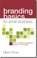
I think I need to write a book about the process of writing a book. What a ride! Branding Basics for Small Business can be preordered if you email preorder@norlightspress.com with your desired qty. All the juicy advice on building an irresistible brand you can stand – plus case studies & anecdotes galore. Here’s the delicious book cover – thank you to Bridget at TRAYcreative (@TRAYcreative for Twitter folk)

Cash flow, creativity, and compassion are not mutually exclusive™

The brand book is coming! The brand book is coming!

Whew! (Hopefully) final manuscript edits sent to the publisher on Thursday. Now we deal with layout and all of that….can’t wait to get this juicy, practical guide into all my favorite entrepreneurs’ and marketing professionals’ hot little hands. Branding Basics for Small Business: How to create an irresistible brand on any budget should be printed and ready to order online in June 2010. (#brandbook if you want to play along on Twitter). I’m so excited for you to read all the case studies from small businesses all over the country who are doing amazing things with their brand. Check out this succulent little promo video to get the juices flowing. Oh, and I’m starting to schedule radio, podcast or article/blog interviews now, so just let me know (maria@red-slice.com) if you’d like me to speak to your community about creating an irresistible brand.

Branding Basics for Small Business: Book Coming June 2010 from Maria Ross on Vimeo.

Cash flow, creativity, and compassion are not mutually exclusive™

When brands disappoint: Hooters

Hear me out.

Put aside your disgust about women parading around in orange short-shorts in a PG-rated version of a strip club named after a derogatory term for the female anatomy. If you can. I agree. Only a few people can really pull off orange well – I know one of them. So that’s exploitation right there.

I am actually a fan of Hooters. There, I said it. I like the tacky sports bar atmosphere. I like that the waitresses get to wear the most comfortable footwear in food service history (thick-soled sneakers and warm socks) while on their feet all day. I love the wings…truly. They are yummy. When I want to get in touch with my inner redneck, I can go there. And I love that Hooters understands that in order to thrive and attract men, the restaurant has to be a place that wives, girlfriends and sig others are okay with their man patronizing.

Have you ever been in a Hooters, as a woman? I kid you not, you are treated like royalty.

See, they get it. They know they have to get you on-side so you don’t freak out if your mate goes there. So they fawn over women. They offer impeccable service to you, they make sure your every need is met, they get you your food piping hot, they make interesting chit-chat (most of the time). In San Francisco Fisherman’s Wharf location, they even have a rule that each waitress needs to check in on your table and sign her name on your placemat to prove someone has greeted you, taken care of you, etc. The waitresses are fun, and friendly, and not overtly sexy and make you believe this could be someone you’d hang out with if you wanted. Their goal is for you to have such a positive experience that you’ll either go with your mate or at least be okay with him going with the boys.

And the wings. The wings really are damn good. Since I don’t have access to the best wings in the world, BW3, here on the West Coast, I have to make do with what I have.

Would I hang out there every Friday? Heavens no. Once or twice a year is fine with me. But even a former fellow female colleague agreed with me – especially about how they treat women customers.  And we made a special trip, by ourselves, to the Vegas one when we were in town. We had a blast.

So Hooters knows what it is. They make no apologies for it, in a “wink-wink, nudge-nudge” sort of way. It’s not like women are twirling from poles bolted to the floor and ceiling. They create an atmosphere of good, cheeky fun. And they get that in order for their brand to survive, they must get women on their side. That kind of self-awareness is rare.

Therefore, I was disappointed when we went to Hooters last weekend in Seattle. The wings were small, greasy and not very tasty. And the service, while great at the beginning, faded away until we finally had to flag someone down to get our check. They weren’t crowded so there was really no excuse. We left disappointed in what we thought the brand experience was going to be and the reality.

The lesson here is don’t make promises you can’t keep consistently. While every location has a different manager, it’s the company’s job to ensure the experience is the same no matter where you go. See McDonald’s. if you are going to invest so much into creating a strong brand experience, you have to work just as hard to maintain it again and again and again.