Cash flow, creativity, and compassion are not mutually exclusive™

Saddle Up! Brand Your Business workshop August 12 in Bellevue

Join us on Thursday, August 12 in Bellevue, WA for a spirited and practical discussion on what branding is, why it matters and how to build a great brand on any budget. I’ll be the marketing and brand speaker at this Biznik event, hosted by partner-in-crime Lynn Baldwin-Rhodes of Power Chicks and Marketing Shebang (don’t worry, men, this is a “come one, come all” event focused on building a rabid fan base for your business, so please stop by – we’re after smart, savvy business owners and entrepreneurs, no matter which gender). I’ll speak to some business boosting basics and will also have my branding book on hand if you’re interested in DIY brand strategy. Hurry! A few spots still left but you need to RSVP.

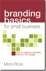
Speaking of which, I’m loving this fab review I received from Midwest Book Review:

What makes your business unique, something hat stands out from the pack? “Branding Basics For Small Business: How to Create an Irresistible Brand on Any Budget” is a guide to branding and how it can literally be the deciding factor on the success of business. Brands make connections with customers, keep your product in mind, attract employees, and keep a business strong. “Branding Basics for Small Business” is a wise and recommended read, not to be missed by any small business.

If you haven’t yet taken a bite of the book that I’ve been told people can’t launch a business without, please grab your copy today!

Cash flow, creativity, and compassion are not mutually exclusive™

Why saving money on branding can cost you

We’ve all seen it – and maybe done it. We spend money on lawyers or accountants to build our business the right way, but when it comes to something like a logo or a website, we think, “Why, my neighbor’s teenage niece knows how to use Illustrator! Maybe she can do my logo for free.” Or, “I just need to get a simple website up. Let me just slap together a DIY template and get the page up and running.”

While these are steps you may need to take initially to get your business off the ground and money coming in the door, skimping on a well-thought-out and intentional brand strategy long-term can cost you way more in sales later on. This fundamental mistake is what inspired me to write my book.

Branding does not have to be some big expensive effort that only large companies can afford. If you run a small business, you need to spend time thinking about and conveying your brand as well – at whatever budget you have to spend.  Brand is more than just your logo or website – it’s your essence, your core. It’s the experience people have with you, the impression you leave in their minds. So you need to really think about what you want that impression to be and ensure that you communicate it consistently in three important ways: visually, verbally and experientially. Only with consistent exposure to your brand promise in every touchpoint will customers connect with you and become rabid fans, thus increasing your profits long-term.

And while brand is more than the visual identity, your design look is still a key part of it. Buyers make decisions subconsciously and need to be attracted to your look and feel first before they will learn enough to buy from you. Just like dating, your appearance does not define who you are but it does factor in to initial first impressions. So why do so many entrepreneurs try to cut corners on the very first thing that potential customers will see?

Hiring unqualified people or designers who don’t ask you anything about your value proposition, differentiators, or target audience is not the way to save money. I talk to many people that threw away money because their brand strategy was not baked yet. Good design is a skill: it’s a skill that involves taking a message and communicating it visually, not just creating a pretty picture. You will lose more in lost sales by getting this part wrong than you will save on cutting corners.

And guess what? That brand strategy will do more than just inform your visual identity. It will serve as a compass for other marketing investments: partners, advertising, events. Basically any decision your company makes will be a smarter one if you start with the brand strategy first and use it as a compass. This helps you avoid throwing away money on what I call “random acts of marketing” and ensures that you only invest in activities that move your business forward.

If you need to save money, the best thing entrepreneurs can do is to first sit down and create a clear, strong brand strategy before any marketing, design or development takes place. This entails defining who you are, what you represent, what feelings you want to evoke, what value you provide, how you price things, who your ideal audience is, and how to best reach them. This requires sitting down and answering some key questions. People that don’t do this first and launch into creating a website or investing in marketing programs are just throwing their money away. When you have no destination, every road looks like it leads somewhere.

Know thy audience and thy brand strategy and you will know the best design options, communication vehicles and marketing tactics in which to invest. Translation: only pay for things that will move you forward and give you a return on your investment. Saving $1000 and then ultimately losing $10,000 in sales opportunities because you didn’t connect with your target customer does not seem like a good investment strategy to me.

Cash flow, creativity, and compassion are not mutually exclusive™

Want juicy brand advice? Check out this pretty book


FinalBookCover

I think I need to write a book about the process of writing a book. What a ride! Branding Basics for Small Business can be preordered if you email preorder@norlightspress.com with your desired qty. All the juicy advice on building an irresistible brand you can stand – plus case studies & anecdotes galore. Here’s the delicious book cover – thank you to Bridget at TRAYcreative (@TRAYcreative for Twitter folk)

Cash flow, creativity, and compassion are not mutually exclusive™

The brand book is coming! The brand book is coming!

Whew! (Hopefully) final manuscript edits sent to the publisher on Thursday. Now we deal with layout and all of that….can’t wait to get this juicy, practical guide into all my favorite entrepreneurs’ and marketing professionals’ hot little hands. Branding Basics for Small Business: How to create an irresistible brand on any budget should be printed and ready to order online in June 2010. (#brandbook if you want to play along on Twitter). I’m so excited for you to read all the case studies from small businesses all over the country who are doing amazing things with their brand. Check out this succulent little promo video to get the juices flowing. Oh, and I’m starting to schedule radio, podcast or article/blog interviews now, so just let me know (maria@red-slice.com) if you’d like me to speak to your community about creating an irresistible brand.

Branding Basics for Small Business: Book Coming June 2010 from Maria Ross on Vimeo.

Cash flow, creativity, and compassion are not mutually exclusive™

Telling a story with a label

Love this post by Seth Godin about how simple things like labels and packaging can help further your brand story and customer promise. This is what I mean by finding a unique way to tell your story in every customer touchpoint you have. Some people may just slap a functional label on their product or put it in a boring box. But get creative and find a way to carry your brand promise through to the way the item looks when people see it on the shelves or get it in the mail.

While some packaging ideas do indeed cost way more than others, cash-strapped businesses can still get creative and find a way to present their products in a delightful way that actually furthers their message to customers. Use color, intriguing words, or other ideas to stand out. It’s not about money, it’s about creativity. But it’s also about clearly knowing what your story is so that you can convey it effectively.

Cash flow, creativity, and compassion are not mutually exclusive™

Does your space match your brand?

We’ve all experienced that horrible disconnect that happens when a shop or restaurant looks completely different on the inside than the image we got from their ads or messaging. Or what about when a business that you’ve built up in your mind as “sophisticated, classy and cutting-edge” is actually in a sad office park with what looks like Goodwill furniture and bad paneling on the walls?

Your office, store or place of business should reflect your brand promise and the traits you “sell” in your marketing. If you portray your business as playful, innovative and bold, then your offices where you greet clients better portray that. Whether it be through the furniture style, paint colors, artwork or even location, you need to map your brand to the experience customers will have interacting with your space. Many good ad and branding agencies actually have architectural and space planning services to carry the brand through to your location.

This is where folks that think brand is just a logo fall down. If brand is the entire package of reputation, experience and imagery I have in my head, then my experience and perception of the physical space matters. The devil is in the details, as they say.

Bare Escentuals, the mineral makeup company based in San Francisco, was just purchased by Japan’s Shiseido, a high-end makeup line sold in department stores. The brands actually have common core values focused on natural beauty – but with slight variations. I read that if you visit Shiseido’s offices in Japan, you are “greeted by  3 receptionists in matching pink suits who stand up and bow ceremoniously whenever a guest appears. A small Zen garden with spherical plants sits on the executive floor.” They have a very strong image they want to convey that is consistent with the natural beauty and polished sophistication of their brand. Bare Escentuals’ offices in San Franc are more or an organic “mess” according the founder, in line with their natural, carefree beauty brand – people running around in jeans, that sort of thing.

Botom line, if your space welcomes the public (I”m not talking about home offices here, although you can make an argument that you might want to inject some brand elements into that if you can) is should remain consistent with your brand promise and image. Every customer touchpoint matters, especially interacting with your physical surroundings.

Cash flow, creativity, and compassion are not mutually exclusive™

Ask the Expert: Using social media to delight & provoke, plus how studios know whether to cast Ashton or not

Part 2 with Scott Montgomery, (see Part 1 here) this time about social media mayhem and his new firm that tracks and analyzes entertainment buzz, Fizziolo.gy. 

RS: Tell me about social media’s place in the branding equation? Who’s using it right? Do you think it works better for smaller or larger companies?

SM: Well I know how companies are doing it wrong. There is nothing more obvious than planted comments to a planted glowing review of a product in a planted blog. I don’t know, maybe that fools somebody, but I think it’s pretty transparent to all but the newest of newbies who would still use the word “newbie” in conversation.

It’s not surprising that, right now, most of the branding successes in social media are directly related to enthusiast brands, those that can offer value through social engagement, and those that are creating a bit of controversy. Google, for example, wins in social media not just because they engage in it, but by the fact that their innovations are worth tweeting about. I can’t tell you how often we’ve seen Google Wave as a trending topic on Twitter, not because of active seeding, but because their tactics have got people talking – releasing controversial videos of Wave in action, beta-testing by invitation – that sort of thing. I’m certainly not ruling out some kinds of seeding, but it’s all more powerful if you devise your product’s strategy to be inherently “political”. By that I mean, create things where the audience has a reason to take your side (or at least a side). Let your product efforts, promotions and events be retweetable.

Guys like me sometimes get a bit of stick because we sing the praises of social media to a background chorale of “where’s the ROI?” I believe we do create mass movement in behaviors. But as in any medium, it pays to harness the energy where the mass is, and not necessarily via a custom community. You don’t have to be a huge company to do it. A few weeks back, a motivated Facebook group succeeded in making an old Rage Against the Machine single 2009’s Christmas Number One. Now, Christmas Number One is a big deal in Britain (remember Love, Actually?) and Jon and Tracy Morter were disgusted that for the last few years, whatever won on Simon Cowell’s X Factor automatically went to number one at Christmas. Did they build a custom website to vent? Nope. They went to where the mass was – created a Facebook community and translated online behavior into real-world results – results that have a real economic impact on all the players in the controversy.

If Jon and Tracy from Essex can do that, shouldn’t a company with resources be able to move online behaviors to real-world action too? You just have to create something that makes people care.
Back here at my agency, we recently won an OMMA award for best standalone video for Microsoft – a review of the History of the Internet  by some of the odd characters who inhabit it – to promote the launch of Windows Internet Explorer 8. But it wasn’t the video itself that was unique (though it is kind of hilarious), it was the way we distributed it. IE8 was set to launch at MIX09 to a crowd of developers. The video preceded the launch, and we made sure the amused attendee had a url to share. As insiders, they were emotionally driven to distribute the link to everyone they knew. IE8 was a trending topic for a big part of the day, and chatter about the video was a big part of it. Getting the Windows community to download IE8 was a key effort for 2009 – motivating those downloads though harnessing social media was a big part of accelerating the effort.

RS:  Tell me about Fizziolo.gy and the new way companies are using social media in their marketing mix
RS: Fizziology  is a tracking company we started in mid-2009 to take advantage of information that can be gleaned from what people post on Twitter, Facebook, blogs and other social media tools. Right now, we’re providing insights to movie studios and production companies, tracking what people are saying about movies as they approach release and upon opening – we’re consistently performing better than traditional tracking companies do.

So far I think it’s pretty amazing.A lot of companies are springing up here and there, trying to make marketing sense of this mountain of data – it’s becoming known as the Real Time Search industry (which I think is a stupid term). But almost all of them use some form of automated keyword scoring methodologies, and they just aren’t real accurate. In our world, “dude, that movie is sick” could mean something bad or good, but you can’t know that from a prejudged keyword algorithm. We actually read and score a statistically significant number of the total volume of chatter relating to a person, entertainment property or brand, and treat it like the world’s fastest, most honest focus group. So we believe we know more about the tweeting public’s intent to take action than a lot of our competitors.

Just recently, and we reported this before anyone else, we saw that the movie The Blind Side was going to significantly overperform reported estimates. Turned out we were right. And we knew The box office for Saw VI was going to be a lot weaker than estimated – we saw very high negatives in the chatter and correlated it with a lower than expected “intention to see”. We could also see the way the interest shifted in Where The Wild Things Are after opening, as people realized that it wasn’t a kids’ movie.

As we move forward, we’re building a database in which we can compare the behaviors of these entertainment properties by genre and seasonality, and we’re building it so we can make comparisons as the public’s usage of social media evolves.

We’ve been asked to track individual actors for insights about how the public might respond to them if they’re cast in a certain kind of role or with other actors. That’s a valuable insight for studios, casting agents, even the actors themselves. We are also beginning to apply the same model to brands.

Every marketer who’s even paying a little attention knows all this sharing is a goldmine for understanding public sentiment about all kinds of things, but there’s no clear gold standard yet. We think our methods give us a good shot at being that.

About Scott Montgomery

One of my favorite people in the world, and the man who teaches me so much about branding and advertising, is Scott Montgomery. Scott is Principal and Executive Creative Director of Bradley and Montgomery,  which has made both traditional and very untraditional advertising, branding and communications for clients like JPMorgan Chase, VH1, MTV, Knoll, Microsoft and many others.

He is also founder of Fizziolo.gy, a firm that tracks and analyzes social media chatter for entertainment companies so they can tell if their movie or TV show will be a hit or a flop.
Cash flow, creativity, and compassion are not mutually exclusive™

Brand is in the eye of the beholder

Check out this fun little experiment in brand perception at www.brandtags.net. They flash a logo up and you type the first thing that comes to mind when you see it. From the site: "The basic idea of this site is that a brand exists entirely in people’s heads. Therefore, a brand is whatever they say it is."  Then you get to see the tags that people typed in and where yours falls in the mix.

Just goes to show that while logos are just visual elements, it’s the promise, and experience of every interaction with the company that goes into its brand. However, if you have had no interaction with a new brand, you will rely on the visual cues (colors, shapes, typefaces) to get a feel for what they are all about. This is why its so important to build a strong brand strategy first, decide what you want to communicate and THEN design a logo. Not the other way around.

Recently, I got a phone call from someone asking about my services for her fledgling business. She asked me my initial impressions of her current logo, which she had paid a marketing agency a lot of money to design for her. Now I normally don’t like to just give spur-of-the-moment audits until I understand the brand strategy and what the company is trying to communicate and to whom. But she had described a bit about her business before I even saw the logo, so I understood some of what her main communication points were.

The first red flag I got for her was that this agency had never once asked her who her ideal customer was before designing her logo. How can agencies get away with such negligent behavior? How can you design something when you don’t know who is consuming it and how they need to feel about it? It kills me that agencies pull the wool over people’s eyes like that.

I gave her my honest impressions of what the color, graphics and font communicated to me. And she was not happy with my answers. She told me how much she liked her logo, and how maybe that was just one person’s opinion. To which I agreed with everything she said. I actually liked her logo, too, and yes, my opinion is just one. One honed by over 15 years experience in marketing communications and branding and understanding how to separate my personal preferences from the needs of the target audience, but yes, one person’s opinion.

My response to her was that my opinion didn’t matter and neither did hers in the end. I liked her logo, too, but it completely contradicted what she had told me she wanted her business to stand for – and quite frankly contradicted the more sophisticated and polished brand image of he website overall, which seemed much more aligned with what she had stated.

And that is what really matters in the end. I have no idea if maybe this logo does strike a chord and attract her target audience effectively – perhaps it does (this would take more work to figure out than just a phone call). But given what she said she wanted her brand to communicate and what her logo was communicating instead, these were my initial first reactions to the logo. And they were not what she wanted to hear. Especially after spending what I assume to be a lot of money.

Brand is in the eye of the beholder. And it’s true: if your target audience loves your look and feel and if it communicates to them exactly what you want it to, then you are right on target. However, everything – color, typeface, graphic style, size, etc – in the logo communicates something consciously and subconsciously. When you (or your designers) don’t do this due diligence in ensuring your visual elements communicate the exact message you want to the exact people you want, leaving room for misinterpretation, then the fault lies with you – not with the people perceiving your brand.

Cash flow, creativity, and compassion are not mutually exclusive™

Brand at Work: Pink’s Original Bakery

PinksLogo I love it when I find cool new branding while I’m out and about. Case in point: my neighborhood Tully’s has been promoting their new bakery items, which are supplied by Seattle’s Pink’s Original Bakery. With the colorful pink striped banners hanging up in store, I just had to grab their brochure.  And when I opened it, I found another example of what I mean when I say “delight your audience.”

Pink’s was started in 1987 by two “babes” (as they say) Molly and Anne. Their story is on the inside of the brochure, which also includes fun photos and clever captions of fresh fruit, cows – even a Polaroid of said “babes.” The vibe is casual, playful and a touch irreverent.  Fresh, organic goodness does not have to be so serious and poignant all the time. 

From the captions written in retro typewriter font, to the colorful comic “talk bubble” coming out of the cow’s mouth (“Moo!”), to their closing line of “We promise to keep working hard to brighten your day with a taste of goodness that can only come from using the best local ingredients and a ton of chutzpah” – you get that these gals are bold, funny and real.  So many bakeries look and sound the same (cue epic music while wheat fields quaver in slow-mo in the early morning sunlight….) so Pink’s stands out. They took the personality of their quirky founders and parlayed that into a quirky brand that made me smile. And made me buy their product.

Delight. That’s the stuff that gives me goose bumps when I experience branding done well. Yes, I’m a marketing geek, I know.

Cash flow, creativity, and compassion are not mutually exclusive™

Is your logo “sexy”?

Excuse me? That’s right….Is. Your. Logo. Sexy.

“But, Maria, I sell packaged software apps to enterprise customers.” or “I provide coaching services.” What do those have to do with being sexy?

By sexy, I mean sophisticated, expressive, uniquely “yours” in the minds of your target audience. “Sexy” is in the eye of the beholder, for sure, but you just need to make sure it’s sexy within your marketspace.

Guest blogger Nancy Owyang, creative director of Eye2Eye Graphics has created a funky assessment to judge your logo’s “it’ factor. She also has some tips to share with us on what makes a logo effective. If you’d like to receive her PDF assessment, please drop her an email at nancy@eye2eyegraphics.com.

Is Your Logo SEXY?
Five Key Ingredients to an Effective Business Logo
By Nancy Owyang

First impressions have the ability to quickly make or break a deal. If you dress to impress for a first meeting with an important business client, doesn’t it make sense for your logo to always put your best foot forward? Having a “SEXY” logo is not just about looks—it’s so much more! It’s about pride, confidence, and knowing that your logo is telling your best story.

Your logo is the most visible way for current or prospective customers to recognize you, know what you do, and how well you do it. Here are five key concepts to ensure a quality, successful logo that reaches your ideal clients and brings the “SEXY” back to your business’s brand identity.

1. Is your business having a visual identity crisis? Your business should have a clearly defined identity with one logo and style that appears on your business cards, stationery, brochures, newsletters—indeed, all your marketing materials. Consistency sends the message that your business is stable and dependable. Your logo needs to visibly represent a business that is professional, successful, and at the top of its field.

2. Is your logo unique to your business? Just as your business is special and unique, your business’s “picture” needs to say “unique” as well. A professionally designed logo will ensure a meaningful identity mark that is memorable and captures the essence of your business.

3. Is your logo breaking the bank? Printing business cards, postcards and other promotional materials can be a major expense. Using color, as beautiful as it is, can be challenging price-wise; the more colors in the design, the more it can cost to produce.

4. Is your logo too complicated? A simple mark is easier to remember than one that is extremely intricate—two good examples are Target® and Nike®. Your logo must be “scalable” and look just as good in a small image on an ink pen as it does on a 10-foot tall billboard. Make sure that your logo also works in black-and-white to allow for maximum flexibility in printing choices.

5. Does your logo have a photographic image in it? Stay away from photographic images in your identity mark; difficult to reproduce and re-size, they often appear fuzzy. And always make sure your logo retains its integrity and legibility when photocopied or faxed; test it on the nearest black-and-white copy machine.

Take an eye-2-eye look at your logo; is it a worn out t-shirt or your professional best? Your logo is a key part of your business identity, communicating an image of your business. Is it the best one? Use these tips to ensure that your logo puts your business’s best foot forward—and moving towards success!