Cash flow, creativity, and compassion are not mutually exclusive™

Attract Business to You the Way The Royals Do

Time for something completely different! Ready to arrange your space to attract more clients, revenue, and success? Today’s guest post is from Linda Rubright, founder of happyhousefengshui.com. Linda has been practicing feng shui for over a decade. She puts a modern, easy to understand spin on an ancient practice to help people quickly and simply attract more love, wealth, health and happiness to their lives.

Royalty in the east determined many, many years ago that arranging their homes (i.e. palaces) in a particular way allowed them to attract more health, wealth, business, love and happiness. It took the western world and their royalty, including the likes of Harry and Meghan, a few millennia to catch onto this (feng shui), but when they did, they tweaked this practice a bit more to their liking (read: they dumbed it way down) and began seeing love, wealth, health and happiness flow their way. 

The good news for us non-aristocratic types is we don’t have to be bothered by all the royal formalities and relentless paparazzi to make the same small tweaks to our homes to attract good things into our lives – including more and better business. Want more clients in your life and money in your bank account? Do as many of these as you can. 

Get a Very Welcoming Welcome Mat for Your Front Door

The front door of the home, the door the architect of the home would call the front door, is considered the entryway to all the energy in your house. It is also the most important area related to your career according to feng shui.  For this reason, make your front door feel very, very welcoming. Starting by tossing your old tattered welcome mat and get a fresh, new cheerful one.

Add Inviting Touches to Your Main Entrance 

Good energy at the entry of your home invites good energy into your home. Consider adding a cheerful wreath, a pot of flowers and/or an outdoor statue near your front door. Definitely toss any gargoyles, lions or signage that feel negative or unwelcoming – we don’t want to scare the energy of your new clients and business away. 

Make the Area Around Your Front Door Clean and 100% Clutter Free

As the front door is both the primary entrance for all energy that enters the home and, in feng shui, the most important area related to your career, it is extremely important this area is very clean. Get rid of any dust, dirt, clutter, messes, mail piles, stinky shoes, unused boots, piles of coats and general eyesores/disorganization inside, outside and around the front door. 

Anytime someone tells me they are struggling with business and/or getting new clients, I always ask how their front door is looking. They typically tell me it is a dumping ground for all things that need to be taken care of – someday. I suggest they clean it up and days later they let me know about new business that fell, seemingly, out of the sky. The clients and business are out there – they just want a clean front door to walk through. 

Actually Use Your Front Door

Whoever said “side door guests are best” clearly did not understand the ways of feng shui. If your front door is neglected and never used, the energy entering your home and around your career and business might feel the same way. To change this, have friends enter through your front door, use it as much as possible in your own comings and goings, have pizza delivered to it – just keep energy moving and not stagnant around your front door. Why? Because you do not want stagnant and stuck energy associated with your career and business.

Weed (Sorry)

If you live in a home and outside your front door are weeds – those things need to go – pronto. The only things we want growing around your literal and metaphorical career area are the good things. Start weedin’.

Get Rid of All Dead Plants IMMEDIATELY

Dead plants are dead energy, and you absolutely do not want “dead” energy entering your home or related to your career area. Toss those babies in the compost pile.

Put Symbols of What You are Trying to Achieve Near Your Front Door

Is there a particular client you want to have or grow? Is there a certain financial number you are trying to hit? Put symbols of what you are trying to achieve, the clients you are trying to attract or even a list of your goals near your front door. The good thing about feng shui is nothing has to be seen to work. Feel free to put these things in a drawer, behind a piece of furniture, behind art, etc. – just make sure it is near your front door!

Remove the Career Killers from Your Office, Cube and Desk

While there are things that help you attract what you want, there are also things that are roadblocks in getting what you want. To make sure you are not doing anything to inadvertently detract good things from entering your life, make sure to get rid of as many of these “career killers” as possible in and around your office, desk or cube. 

  • Clutter
  • Dirt
  • Dust
  • Messes
  • Symbols or reminders of bad memories 
  • Symbols or reminders of who you do not want to be 
  • Things you no longer use
  • Anything broken, torn or no longer working 
  • Files and papers you no longer need or use (this includes electronic files)

And Bonus Tip: Use all of the tips and tricks above regarding the front door of your home for the entryway to your office or cube.

Have Your Desk Chair Arranged So Your Back Is Against A Wall

You know how the boss always has her back against a wall and her underlings sit in cubes where people can sneak up behind them? There are big energetic consequences to this. As you may have guessed, it is best to have the boss’ position (for more reasons that one, right?). Arrange your desk or office so your back is against a wall, and you can see the door or the entrance where people would come up to you. If that is not possible, try putting a mirror up so you can see who is coming behind you. 

Add a Change Bowl in the Upper Left Corner of Your Desk or Office

Stand either in the doorway of your office or if you don’t have an office, sit where you typically would at your desk. Point to the farthest upper left corner from you. This area is your money area in feng shui. To attract more money into your life, put a change bowl here and try as much as possible, not to take money out of it. Also try as much as possible to add that pocket change you have to it. You can put other items associated with money in your change bowl such as jewelry (when I lose an earring I always put the other one here), lottery tickets, gift cards with a few extra dollars on it, foreign currency or even Monopoly money. Extra credit for a change bowl that is purple, gold, green or red (the colors associated with wealth in feng shui). 

Put Your Business Wishes in a Silver Box in the Lower Right Corner of Your Desk or Office

Yes, feng shui can make your wishes come true – especially if you make it known what they are. Write down a list of up to three things you want to happen, but write them as if they have already happened. For example, “I am elated I increased my revenue by 30% in 2019. I am so happy I signed XYZ new client in October of 2019.” Put these three wishes inside a silver box (I have made them out of tin foil before – they don’t have to be fancy). Then, go to your office or desk and either stand in the entrance of the office or sit down at your desk. Put your silver box near the lower right most corner of your desk or office. 

Have any questions? Want clarity on anything? 

Email me (I happily answer questions for free) or visit happyhousefengshui.com for more feng shui tips and ideas.
Cash flow, creativity, and compassion are not mutually exclusive™

Elevate Your Brand through Personal Style with Kaarin Huffman

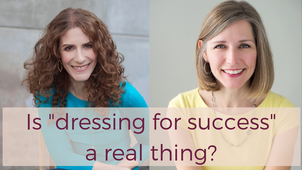
Can what you wear influence whether you land a client, get hired, negotiate a favorable contract or if an audience believes you are credible and trustworthy?

You bet.

Brand extends beyond just your logo or colors to what YOU project when you walk into a room, lead a meeting or take the stage.

Now, some of you may get a little huffy about “judging a book by its cover,” but please watch this amazing interview! You will learn that if you want to project a certain image, but more importantly, CONVEY YOUR UNIQUE TALENTS AND VIBE to the world, you must understand the “psychology of style.”

It helps to understand how our brains are hard-wired to make snap decisions  – even before we say a word.

Today I’m interviewing image consultant Kaarin Huffman. Kaarin has worked with many professionals and thought leaders to help them convey a consistent personal brand through how they dress. And she has studied the psychology of style and how it can impact everything from getting a good deal on a car to closing a sale.

You’ll want to take notes on the fascinating research Kaarin has to share. I learned so much!

“Image consulting is about intentionally expressing your personal values, strengths and brand through what you wear. It’s not about being something you’re not.” (TWEET THIS!)

If you want to elevate your brand from the moment you walk into the room, and land that client, get a good deal or make yourself memorable, please click below to watch the video interview!

YouTube video

Highlights include:

* Why “dressing to your brand” is not about being judged on your looks alone (2:25)

* How to link your brand to your personal style (6:28)

* Why you need to forget what you think it means to “dress professionally” (10:14)

* The two things you’re being assessed on when you walk into a room (14:57)

* The psychology of style: What “enclothed cognition” means to your performance and results. (15:50)

*What to wear to establish credibility…or get a great deal on a car! (16:56)

*Practical tips on how to dress to boost your brand (21:56)

*The Red Sneaker effect and when you have to be careful with style! (30:20)

“The psychology of style is not just for execs or those with money. These little subtle cues are available to everyone who seeks success” (Tweet This!)

Any gems you picked up that you will put into practice? What was the biggest surprise to you? Would love to know!

Learn more about Kaarin at her website and connect with her on LinkedIn. She’s also written some great articles there on using personal style and color to communicate your brand.

Cash flow, creativity, and compassion are not mutually exclusive™

9 Hot Women Your Business + Brand Need Right Now

6.2.15HotList (Blog)

I’m going to be straight with you: stop trying to do everything yourself.

You know who you are: In an effort to “save money,” you sign up for every DIY course under the sun, thinking you’re going to have time to: perfect your writing, code your website, design your flyers, and everything else you need to do to run your business or promote your message. In addition to, you know, doing your actual work.

There’s definitely a time and a place to go it alone. Heck, I offer a self-study digital program that enables you to put together a clear, crisp brand strategy on your own – and folks love it. But savvy business people also know that no one can be an expert in everything. Why should you be, when there are fabulous resources out there? Not to mention that there are just certain things you may enjoy, like writing your blog or designing your materials, and some things that make you want to poke your eye out because it will take you three times as long to be half as good. Time better spent on the real, revenue-generating value you offer, whether that’s making your custom jewelry designs, working with paying clients or writing your next novel.

Folks often ask me for referrals, which I love to provide. This is not a zero-sum game. If someone helps me be successful, my responsibility is to mentor and share to help you, too.

If we can’t share our resources to lift everyone up, why are we even doing this “entrepreneurship” thing? (Tweet this!)

Enjoy my Hot List of 9 ridiculously talented people that will help your biz + brand shine bright. And yes, they are all women (#girlpower). You’re welcome.

Norma Maxwell of Connect Interactive. My website shaman. She has designed and built outrageously on-brand websites for me as well as many of my clients. She’s the genius behind my recent website facelift! Norma gets that your website is not just about good looks, but that it should speak to your target audience and represent your brand well – plus ensure a great user experience to achieve your goals.

Sarah Von Bargen: Sarah and I are long-time partners for many of my clients. She is the writing genius behind my SLICE Sessions. She loves to ghostwrite blog posts or eBooks – and she’s amazing at articulating your unique brand in a way that gets people excited and engaged. She has written a lot of great stuff for me over the years.

Tammy Martin of Martin Marketing: Tammy is a Facebook marketing expert for savvy soulful entrepreneurs. And not just about Facebook ads per se but how to use them to build a true sales funnel and lead your prospects down the path to purchase. She’ll help you build your following, your email list and generate crucial traffic back to your site – all while setting up both your ads and your unique landing pages, dealing with all the technology behind-the-scenes, installing all tracking pixels to make sure it’s working, and tweaking as needed. We had great results working together and I’m eager to work with her on more!

Alison Monday of Tiny Blue Orange: Alison is my website wizard and guardian. She is a designer and developer and ensures your site looks good and stays safe (she’s a techie at heart and is all about security, uptime, and performance). She helps me create pages, improve layout and has designed promotional JPG’s for me. She has also helped some of my clients build wonderful websites that required sophisticated back-end complexity and unique imagery.

Sandy Jones-Kaminski of Bella Domain Media: Sandy is a networking maven and LinkedIn ninja. She combines her expertise in how to network online or offline with her vast knowledge of how to use LinkedIn to generate leads, find connections, and get found by the folks who matter most. She has all kinds of social selling and networking tips and tricks that will change your business.

Anne Watson Barber of Almond Tree Social: Anne specializes in helping her clients boost the ROI of their websites via SEO, paid marketing campaigns, Infusionsoft eMarketing and other tools. As a Search Engine Marketing manager, she focuses on boosting conversions and traffic for large, complex websites. Fun fact: She was a News Editor for Wall Street Journal online before going freelance.

Social Media Gurus: These talented experts have been behind the scenes of some killer brands ranging from authors to consultants to restaurants and can help you develop a practical and powerful social media plan – and even ghostwrite and manage pages for you.

Karen Rosenzweig of One Smart Cookie Marketing

Tracey Warren of Ready, Set, Grow Marketing

Katie Kay of Virtually Savvy

And if you need a dynamic speaker to motivate your marketing team, liven up your next business event or inspire conference attendees into action, you can always enjoy my unique blend of branding and inspirational wit and wisdom but please check out these other fabulous folks as they are gifted presenters on their specific topics. Bookmark this post for when you need to find an amazing speaker for your next event.

Image Credit: Tomi Tapio K via Flickr

Cash flow, creativity, and compassion are not mutually exclusive™

7 deadly marketing material sins you don’t want to make

Your marketing materials should reflect your brand but sometimes, we don’t realize we are killing business softly by overlooking some important details. In our rush to just “get the information out there” we can sometimes do more harm than good to the sales process.

Today’s guest post is from my brilliant colleague Nancy Owyang. As the owner of Eye 2 Eye Graphics, LLC, Nancy is an award-winning designer with strong branding experience. She has aided a variety of clients in rebranding their businesses and I personally adore her design sensibilities and her ability to first understand an owner’s mission and brand, and then translate that complex identity into a graphic representation.  Today she offers up Seven Deadly Sins you’ll want to avoid in your marketing materials.

When it comes to marketing your business it is important to make a good first, second, and lasting impression. (Tweet!)Your marketing materials represent you, your business, what you do, and how well you do it. The list of “DON’Ts” for how to create and use your marketing materials is extensive, but to narrow the focus I have gathered 7 deadly sins of marketing materials that you need to avoid like the plague.

  1. Out-dated materials… or no materials. If you don’t have any other marketing collateral you absolutely need to have a business card, and a website—both create an easy entry into your business for new clients. Your business card and website need to have your correct contact information—phone number, e-mail, and mailing address. Make it easy for people to get ahold of you!
  2. Looking cheap. Tattered edges, stains, crossed out information, bad visuals, no visuals, fuzzy pictures, the same business card and brochure template as someone else in the room—and I could go on—are big “No-No’s.” There is a huge difference between creating something that is cost effective and something that looks cheap. Committing this deadly sin will automatically drop the level of professionalism in your marketing piece by a few notches.
  3. Poorly written copy. Having correct spelling and grammar in your materials should be a given, but unfortunately this often gets overlooked. I encourage everyone to find a good proofreader to review all of your materials. The voice, or tone, of your marketing materials is also very important and needs to reflect the mission, vision, and personality of your business. Working with a professional writer to help you find “your voice” is a valuable component to your brand.
  4. Failure to differentiate you and your business from the competition. I want you to imagine your business as a Hollywood star nominated for Best Actress at the Academy Awards. You step out of the limo, onto the Red Carpet and the unthinkable has happened… you are wearing the same dress as your competition! Just like on the Red Carpet, in business you need to avoid this ultimate faux pas! An important part of marketing your business is to know who your competition is, know how you are different, and express that in your marketing materials.
  5. Not focusing on the benefits. Always keep in mind your target. Look through their eyes and ask the question “well, what’s in it for me?” Go through your entire document concentrating on the benefits of your message, not the features. Another alarming, but all-too-common, trend that I’m seeing is too much “real estate” being given to outlining your education and business history.  Although this is an important part of your business, how well does it answer the burning question in your client’s mind, “what can this company do for me?”
  6. Failing to grab the attention and pain of your ideal clients. Give your audience just enough so that they want more. People don’t want to be overloaded with information. Especially if the marketing piece is a brochure or welcome kit, only provide enough information so that your audience gets the basics of what you offer and how you can solve their pain or problem. If you create some intrigue, your prospect will have other questions, giving you an opportunity to continue the conversation and answer their specific questions.
  7. Inconsistency. Your business should have a clearly defined identity with a style that appears on your business cards, stationery, brochures, website—indeed, all your marketing materials. Consistency sends the message that your business is stable and dependable. Your marketing materials need to visibly represent a business that is professional, successful, and at the top of its field.

Having well -designed and strategically planned marketing materials will help you present a professional image and make a great memorable impression. Failing to present the professional image that your ideal client expects can kill the deal and could stop your business dead in its tracks.

PS, to view a sampling of Nancy’s work please visit her online portfolio.

Do you have advice or lessons learned about your marketing materials? What one action will you take on your materials based on what you learned in this post? Would LOVE to hear it in the Comments below.

Cash flow, creativity, and compassion are not mutually exclusive™

3 reasons why you should care about your brand strategy

I was so proud to see that a past Red Slice client, Talent Technology, recently officially rebranded the entire company as Talemetry, which was the brand we created initially for their successful flagship software product.

This project was a textbook case for why methodically working on the brand strategy first leads to super successful outcomes. Instead of simply coming in to slap a name and logo on a new product, the first step was a brand strategy session to articulate the company’s overall vision, target customers, and messaging before we brought this down to what that meant for the flagship product. This careful thinking made the product launch and company rebrand so successful that they finally pulled the trigger on adopting Talemetry as their overall corporate identity.

When we embarked on that project, the client knew that “re-branding” was not merely about the visual. It was about how they walked and talked as well: messaging, product development, customer experience. The whole kit and caboodle. And their savvy paid off in a big way.

So I thought this week, we’d all take a step back. Enjoy this video I did for MySourceTV – it’s a refresher course on what “brand” really means and the 3 big reasons (or the 3 C’s as I like to call them) why thinking through and articulating your brand strategy absolutely matters to your success.

What is Brand and Why Should You Care?

When you think about brand in this way, you realize there are many different ways to refresh and reboot your brand that have nothing to do with overhauling a website or spending thousands on new logos and materials. (Tweet!)

Cash flow, creativity, and compassion are not mutually exclusive™

Do you judge wines by their labels? An adventure task…

While we are all taught not to judge a book by its cover, let’s get real. I’ve bought books, magazines, scented lotions, household cleaners (how can you resist Method’s packaging?) and yes, wine based solely on how the label looks.

I’m a marketing groupie. I admit it. I’m a sucker for cute, clever or crisp packaging.

As a former wine writer and still-active wine lover, I know that some gems are hidden in the ugliest bottles and even price does not necessarily guarantee “bottled poetry” But I’ve fallen in love with cheeky, well-designed wine labels over the years which enticed me to buy and try the product.

Nothing conveys a brand personality – and hints at the quality and delight of the wine experience bottled inside – like a wine label. And there are many diverse ones out there, all trying to communicate why they are good, how they are different and to stand out from the hundreds of options out there.

Your business needs to ensure its “wine label” stands out from the crowd. Can prospects tell what kind of product, service, or quality you offer right off the bat? If you don’t think visual identity or your website quality and design matters (“I offer amazing products/services. That is enough to convey my brain.”)  – think again. One stat suggests that in less than 10 seconds, you have the opportunity to lose or gain a valuable customer – just based on your website’s layout and visual appearance.

Your Slice of Adventure, should you choose to accept it:

Peruse the racks at a local wine shop or the wine aisle of your favorite supermarket.  Pick three vastly different wines based on their labels – don’t look at the price!! Just from the label, colors, font, copy – even the shape and size of the bottle – ask yourself four questions:

1) For what occasion would this wine be a good fit?
2) How does the wine taste?
3) Who is the winery’s ideal customer? Age, personality, lifestyle?
4) How much does the wine cost?

You will soon see in action how our immediate responses to visual cues tell a whole story that words never could. This is how people are judging your business: by your website, storefront, signage, product design. This is a powerful lesson in making sure all of your communication channels convey the right clear, consistent message that you intend.

And enjoy your wine. You didn’t think I’d skip the actual taste/experience test, did you? That’s the fun part.

PS, I’m also in love with unique wine/winery names, especially saucy ones. Here are some for your amusement:

Bonking Frog
Fat Bastard Wine
Spoiled Dog Winery
Kung Fu Girl, Boom Boom and The Velvet Devil from Charles Smith Wines

Please report back your findings below in the Comments – and of course tell us if you recommend the wine! Any faves you already have that you can share? Please do…

Cash flow, creativity, and compassion are not mutually exclusive™

How to build an effective website and look like a million bucks: A chat with Nancy Owyang

How can small business owners with shoestring budgets and even less time create a powerful and professional looking visual web presence for their brand? While your website is only one brand facet, it’s an important one. I work with clients on their brand story and messaging but how can they communicate that brand online? Nancy Owyang, Creative Director and Owner of Eye 2 Eye Graphics, is a cherished partner of mine and produces amazing, simple and elegant work. She works with small business owners to make their business memorable through meaningful, strategic, and professional graphic design.

Her mission? To provide small business owners high quality, professional brand identity design that will make them stand out in a crowd and allow them play with the big kids… all at a price they can work into their budget.

I sat down to talk to her about what people are doing wrong with their websites and how small businesses can create big brands.

RS: Nancy, what are three helpful hints you have for folks building a business website from scratch? Or put another way, what are some of the biggest mistakes that make you cringe?

NO: Hmmmm… good question, so besides my obvious 3 hints of:

  • Don’t do it yourself
  • Don’t have your neighbor’s 16 year old nephew do it, and
  • Do find a designer and programmer who work and collaborate together—it’s rare that both a programmer’s mind and a designer’s mind can live in the same body

I’ll dig a little deeper and give you maybe some less obvious hints.

Have a plan. This can be something that a client brings to the project, or we can create it together, but having a plan is important for any project, especially a web site. Web sites have a tendency to grow and evolve, which is one of the beautiful things about them, but this makes having a plan even more important. This is the foundation that will guide us to make decisions about the site to make sure we stay on track and true to the business goals—in essence just because you can do it on the web doesn’t mean you should. A few things to think about for the plan:

  • How the site will be used by current clients and potential clients?
  • Is it a place that users come back to over and over? Or is it mostly just visited when they are considering hiring you?
  • What is the experience that you want to create?
  • Does the client need to be able to easily make updates to the site?

Think ahead. You’d think that this might fall into the obvious hint category, but it’s a
good one to point out. Things to think ahead about include:

  • Timeline. Rome wasn’t built in a day, and neither will your web site. Good site design  and development takes time. For a smaller site, expect and plan for at
    least 3 months from idea to launch.
  • How do you plan to edit the site in the future? Many small business owners want to be able to edit their site themselves: this will require the back-end of the site to be built in such a way that you can do this without learning to be a programmer in your spare time. If you’re a larger business, this may be a piece that you hire out, so the site could be built using a different back-end framework.
  • As your business grows, how will your web site change? Will you need a shopping cart? Do you want a built-in blog? Will you want to add a calendar of events? These things and more are things to think about when setting up the site initially.

Work with professionals for all parts of the site. An effective web site is an investment in your business and if planned appropriately will last you for several years with just minor updates to keep it fresh. So with that in mind, not only do you need a great designer and programmer pair, but you will also need a great copywriter to execute the voice of the site. This is important not only because this is your chance to communicate with your clients, and introduce yourself to potential clients, but this is what the search engines see too! Working in your search engine optimized keywords into the copy of the site so it doesn’t seem awkward and contrived can take some finesse. If you want to write the copy yourself, at the very least I recommend having it reviewed and edited by a professional copywriter who has experience writing for the web.

RS: What key factors do you consider when you design and develop a client website?

NO: The main thing that comes to mind is how important it is to put yourself in the seat of your website user. Who are they? Are they potential clients checking you out? Are they current clients? Are they just passing through doing research or gathering ideas? Do they come back over and over again? How do they interact with the site?

Once you know this information it will help you decide what needs to be included in the site, this will also determine how the site is updated, and how often. A site that serves more as a “brochure” site where potential clients come to check you out doesn’t need to be updated as often as a site that has an ongoing interactive relationship with the users. So it’s good to know upfront what site experience you want to build.

RS: In what ways do you see web presence as “the great equalizer” in helping small companies to compete with big brands?

NO: The amazing thing about the web is that every business no matter the size or location is available to people around the globe 24 hours a day, 7 days a week. If your site is set up properly with professional design, well-written content, and search optimized
programming, your site can pop right up at the top of the search with the “big
kids on the block”.
The potential client never has to know that you are a solo-entrepreneur working in your PJs out of a home office, while you have 2 kids under the age of 5 running around. You decide how big you want to be on the web and make it happen.

This comes with a warning… since the options are potentially never ending it is important to have a plan and a target, and stick to it. Think of it this way—aim for the bull’s eye, but if you get hits on the other part of the board you still get the points!

Just because the web gives us the platform to compete with the big brands, you need to be honest and ask yourself, is that what you want? Once you have your answer, position your site accordingly using the visuals, the voice, and all the search engine optimization goodies. Your website is your virtual brick and mortar. How big do you want it to appear to the site visitors?

About Nancy:

As the owner of Eye 2 Eye Graphics, LLC, Nancy Owyang is an award-winning designer with strong branding experience. She has aided a variety of clients in rebranding their businesses, including Women Business Owners, SLN Stage + Design, Delane Engineering and many more. Clients praise Nancy’s design sensibilities and her ability to first understand an owner’s mission, and then to translate that complex identity into a graphic representation. Her branding and design solutions are practical and unique, detail-oriented, on time, and on budget. To view a sampling of Nancy’s work please visit her online portfolio.

Cash flow, creativity, and compassion are not mutually exclusive™

What your website says about your brand (and how to make sure it’s telling the right story)

Guest post by Seth Leonard who trains and mentors people who want to build dynamic, successful websites. 

Human beings spend their days sizing things up. Think of the last time you looked for a place to eat along a street lined with restaurants.Whether it was the well-positioned outdoor seating of a cafe or the use of neon by a deli, you probably formed almost immediate opinions about where you might want to eat based on these quick observations.

With all of the information surrounding us, we rely on these fast judgments in order to get through the day. Otherwise, we’d be drowning in a sea of data.

There is no vaster sea of data than the internet. So the snap decisions that people make about your website and what you have to offer come fast, and are most likely final.

Today we’re going to look at the key elements of your website that determine what people think of you and your brand, as well as how you can make sure these elements convey exactly what you want.

Let’s dig in. One of the first things someone looks for when they come to your website is…

A Deliberate Design
Just as you judge a book by its cover or a clothing store by what’s featured in the window, your website design is the first thing a visitor sees. It is, therefore, the first thing visitors use to assess your site.

A deliberate design indicates a brand that knows what it’s about.

And a deliberate design does not necessarily mean what some might call a “professional” design. Instead, visitors want to see a look that is in line with your brand and demonstrates that you made a choice in how to present yourself.

Take a look at http://zenhabits.net. I’ve never seen a more simple website design. Yet, for a blog that discusses minimalism, focus, and a lack of clutter, it’s a perfect representation of its brand.

Visitors want to know you made an effort, even if it’s an effort to simplify. They infer that if you put effort into your design, you put similar effort into creating something worth their time.

Tip: Find websites that you like and notice how their design reflects their brand. Whether it’s the straight lines and rounded edges of apple.com (that look exactly like their products) or the vibrant colors here at Red Slice, take note of the choices being made.

Make deliberate choices about your own design.

Evidence of Legitimacy
Have you ever been the first to arrive at a party and wonder if perhaps you should have done something else with your evening? Have you ever been the only one sitting in a restaurant and feared your food would explain why no one else was eating there? That’s because we look for others to validate and legitimize our choices. This helps us make sure we’re not alone in thinking something is a good idea.

Visitors look for evidence of legitimacy from your website, as well. Whether that’s the number of comments your blog posts are getting or glowing testimonials from past clients, they want to make sure they’re not alone. They don’t want to be the only person at the party.

A lonely website implies an unsuccessful brand.

Tip: Demonstrate evidence of your legitimacy. If you’re getting a good number of comments, make sure visitors can see that. If you have a lot of Twitter followers, make sure your “Follow Me” button includes that count.

If you’ve written guest blogs for others, include an “as seen on” section to your sidebar and display the logos of sites you’ve contributed to. If you have testimonials, get those up. If you don’t have testimonials, ask people you’ve worked with if they will write one for you.

Make sure your visitor knows that they’re not the only one at the party.

Uniqueness
There are a lot of websites on the internet. Odds are, a number of people are doing something similar to you. And more than likely, someone coming to your site has seen someone else attempt the same thing you’re doing.

We get bored when we see the same thing over and over again. I’m sure there are differences between a Honda and a Toyota, but as soon as I see a commercial for a sedan driving along the coast, I either flip the channel or head to the kitchen for a snack. I’ve already seen what they’re going to tell me.

Visitors value uniqueness, something new. They want to know that they’ve found something different, something ground-breaking.

Uniqueness is the hallmark of a ground-breaking brand.

Tip: Exhibit something unique about yourself, your style, or your offering. On every page. Whether it’s an attention-grabbing tagline or framing your work in a way that no one else does, make sure you have something that stands out from the crowd. Imagine your visitor is going to tell their friends about your brand. What unique element of the work you do can they share after just ten seconds on your website?

Promise of Value
To overuse my party analogy: when attending one, people want to know that they’re going to gain something out of the evening’s festivities. If you walk into a friend’s house with lovely decorations and a great stereo, but are not convinced that you’re going to walk away having had some good conversation or good food, you’re going to looking for an exit.

Even if you design an attractive website with evidence of legitimacy, you need to exhibit the value you can provide. People appreciate what they might call a “good” website, but they stay for what they know is a valuable one.

A strong brand is synonymous with what it actually delivers.

Tip: This one is easy. Promote your value, not yourself.

Make sure the brand you develop speaks to the value you provide, not just how cool you are. Make it obvious what your visitors are going to walk away with.

Putting it All Together
Your unique brand will determine how to best put all of these pieces together. But it is critical that you think about all of them as you develop your website. Step into your visitor’s shoes and try to look at your website from their perspective. What do you see? What are your first
impressions?

If you have a hard time doing this, ask others for help. Ask your friends what they see when they look at your website. (Editor caveat: Always wise to get an objective opinion, but take with a grain of salt if they are not your target market!)

And remember that not everyone comes to your website through the homepage. Make sure that the branding efforts you make are apparent on every page of your site. A visitor finding you through a single blog post should pick up on the same strengths of your brand as those that come in the front door.

I almost turned that into another party analogy, but I didn’t.

What do you want your website brand to be? What changes can you make to ensure that it’s obvious to your visitors? Let me know in the Comments.

Cash flow, creativity, and compassion are not mutually exclusive™

Open letter to all business owners and entrepreneurs

Dear ambitious friend,

It pains me to see the money that you are wasting, not to mention the time lost and stress created, by turning to the wrong people for your marketing and branding needs. Just yesterday, I heard another tale from a friend whose client is taking branding advice from a website programmer. And it’s bad advice that will cost her way more money in the long run.

Think of your business like your house. Would you turn to your plumber to draw up architectural plans for your new renovation? Would you ask your cleaning person to re-wire your stereo? Would you consult your gardener for interior design advice?

Then why, oh why, do you continue to try to get all your marketing, PR and branding needs met by one person?  Web design, web programming, direct mail, brand strategy, PR, writing – these are noble and important skills that require expertise in specific areas in order to help you meet your goals. Each person is skilled in their craft and understand the nuances of it, to be sure. But asking a programmer what your logo should look like or an SEO expert how to create a brand positioning statement makes just as much sense as taking your sick dog to your dentist.

In the story mentioned above, this client claims she “likes” her web programmer. I’m sure she does. He’s probably awesome…at programming. But that doesn’t mean he understands how to  design a site well, or understand user interface techniques or even how to create a strong differentiated brand.

I’m sorry, but you can’t have it all. Marketing  – and business building in general these days – requires that you put together a team of specialists. When I worked in corporate, I often managed these people together as one cohesive team. And that is what I do for my clients: I am the brand strategist but I bring in designers, email marketers, or SEO experts to deliver on the client’s goals. I stitch the right team together for them to meet their needs. I can’t be all things to all people, and anyone who tells you that is lying.

When you need a business plan, go to a business planning consultant. When you need to communicate things visually, go to a designer first (who can subcontract a web programmer for you if you need to build a website). When you need to get schooled in the fine art of email marketing, go to an email marketing or online marketing expert. When you need a press release or want to get into the paper, seek out a PR consultant or publicist. And when you need brand advice, seek out a branding consultant or strategist.

Stop shooting yourselves in the foot and do right by your business – and save your sanity in the process.

Good luck!

Maria

Cash flow, creativity, and compassion are not mutually exclusive™

Why saving money on branding can cost you

We’ve all seen it – and maybe done it. We spend money on lawyers or accountants to build our business the right way, but when it comes to something like a logo or a website, we think, “Why, my neighbor’s teenage niece knows how to use Illustrator! Maybe she can do my logo for free.” Or, “I just need to get a simple website up. Let me just slap together a DIY template and get the page up and running.”

While these are steps you may need to take initially to get your business off the ground and money coming in the door, skimping on a well-thought-out and intentional brand strategy long-term can cost you way more in sales later on. This fundamental mistake is what inspired me to write my book.

Branding does not have to be some big expensive effort that only large companies can afford. If you run a small business, you need to spend time thinking about and conveying your brand as well – at whatever budget you have to spend.  Brand is more than just your logo or website – it’s your essence, your core. It’s the experience people have with you, the impression you leave in their minds. So you need to really think about what you want that impression to be and ensure that you communicate it consistently in three important ways: visually, verbally and experientially. Only with consistent exposure to your brand promise in every touchpoint will customers connect with you and become rabid fans, thus increasing your profits long-term.

And while brand is more than the visual identity, your design look is still a key part of it. Buyers make decisions subconsciously and need to be attracted to your look and feel first before they will learn enough to buy from you. Just like dating, your appearance does not define who you are but it does factor in to initial first impressions. So why do so many entrepreneurs try to cut corners on the very first thing that potential customers will see?

Hiring unqualified people or designers who don’t ask you anything about your value proposition, differentiators, or target audience is not the way to save money. I talk to many people that threw away money because their brand strategy was not baked yet. Good design is a skill: it’s a skill that involves taking a message and communicating it visually, not just creating a pretty picture. You will lose more in lost sales by getting this part wrong than you will save on cutting corners.

And guess what? That brand strategy will do more than just inform your visual identity. It will serve as a compass for other marketing investments: partners, advertising, events. Basically any decision your company makes will be a smarter one if you start with the brand strategy first and use it as a compass. This helps you avoid throwing away money on what I call “random acts of marketing” and ensures that you only invest in activities that move your business forward.

If you need to save money, the best thing entrepreneurs can do is to first sit down and create a clear, strong brand strategy before any marketing, design or development takes place. This entails defining who you are, what you represent, what feelings you want to evoke, what value you provide, how you price things, who your ideal audience is, and how to best reach them. This requires sitting down and answering some key questions. People that don’t do this first and launch into creating a website or investing in marketing programs are just throwing their money away. When you have no destination, every road looks like it leads somewhere.

Know thy audience and thy brand strategy and you will know the best design options, communication vehicles and marketing tactics in which to invest. Translation: only pay for things that will move you forward and give you a return on your investment. Saving $1000 and then ultimately losing $10,000 in sales opportunities because you didn’t connect with your target customer does not seem like a good investment strategy to me.